Customer analysis – Tinder for companies
Never lose a client again.
__________
PROJECT
Odoo dashboard
KPQ
How do I never lose a client again?
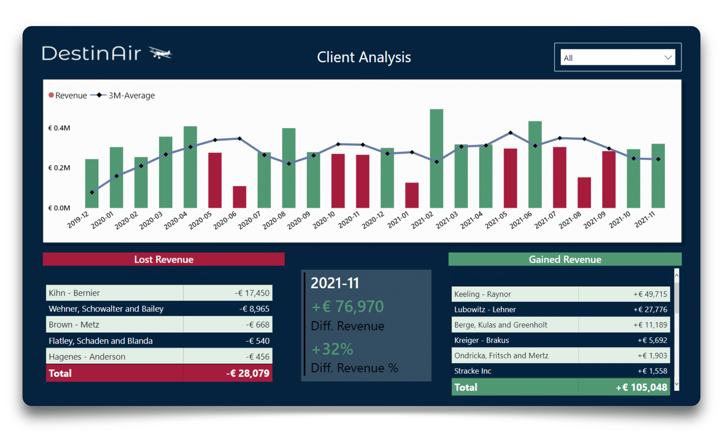
Odoo is an ERP software application for SMEs. In just 3 steps, you can download a Power BI dashboard and connect it to your own Odoo business data. The dashboard provides an analysis of customer sales. It analyses the relative evolution of sales per customer and thus serves as a leading indicator for your sales and customer relations.
1. Open the dashboard once a week
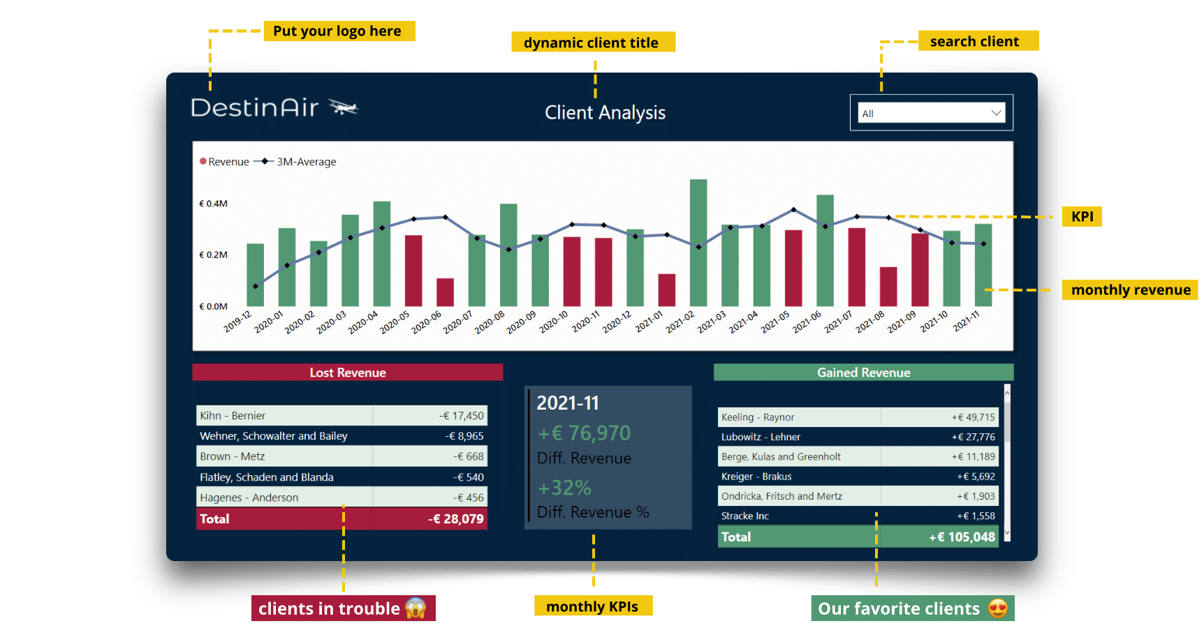
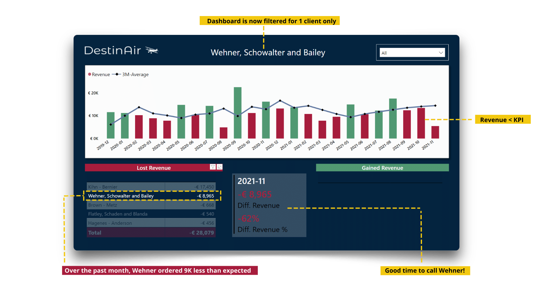
At the top, you will want to see green bars. This means that you have sold more (€) than you had projected for that month (KPI). Projected sales are calculated as a 3-month moving average. Green bar means sales > KPI, red bar means sales < KPI.
In the lower part of the dashboard you can see the customers that caused the biggest decrease (red table) or increase (green table) in sales. In the middle, you can see the exact results (€ / %) of how your business performed in the past month. In this case, our turnover for 2021-11 was €76,970 higher than expected.
2. Select one month to filter the dashboard
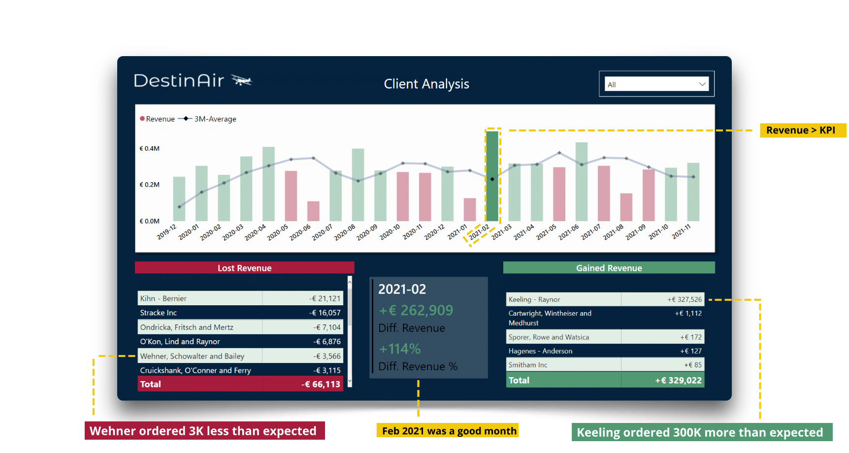
Now suppose you want to analyse one month in detail. Take February 2021, as your earnings were particularly good that month. Just click on the (green) bar of that month to filter the entire dashboard. You can immediately see that this increase is solely due to Keeling-Raynor ordering a surplus of €300K.
3. Select a client to filter the dashboard
Next, you will want to analyse how the sales of a specific customer have evolved over time. Easy! Click on the customer's name or type the name into the filter on the top right. All visuals are filtered again and you can now clearly see that Wehner has been ordering less than expected for 3 consecutive months. This month alone he has ordered € 9K less! Good time to call him.
Download our dashboard portfolio.
Learn how BI can help your company.
✔ Management dashboards
✔ Financial KPIs
✔ Power BI examples
✔ Free advice
