Introduction
In today’s competitive landscape, insights drive action. But raw numbers rarely tell the full story. Whether you’re a business owner, CFO, or team lead, what you need is clarity: clear signals from (sometimes complex) data.
That’s where Power BI comes in—not just to show dashboards, but to turn data into decisions. Behind those visuals is DAX (Data Analysis Expressions), the formula language that transforms static figures into dynamic, actionable insights.
With the right DAX formulas, you can:
- Sharpen your view of sales and financial forecasts
- Spot risks and opportunities before they escalate
- Model future scenarios instead of reacting to them
- Build dashboards that inform and recommend
We’ll cover:
- Core DAX concepts like context and filter logic
- Five high-impact use cases across finance, operations, and HR
- How to apply them in real-world dashboards that drive decisions
Whether you're leading strategy, managing budgets, or overseeing teams, this is your roadmap to using Power BI as a true business intelligence engine.
1. Time Intelligence - Year to Date analysis
One of the most common executive questions is deceptively simple: “How are we doing compared to last year?” But answering that well across multiple KPIs and timeframes, often requires static reports, spreadsheets, or multiple versions of the same visual.
Thanks to YTD dashboards, just as in our example, we can use DAX together with time intelligence logic to give users full control over the reporting timeframe, without needing multiple pages or manual toggles.
Together with the date filter at the top, you can create specific views on the same matter:
- Month – shows the selected period vs same period last year in monthly bars
- Quarter – shows the selected period vs same period last year in quarterly bars
- Year-to-Date (YTD) – shows the total progress from January to current month
Together with other slicers such as KPI selector and the scope, you can get a dynamic view on:
- Total actuals and reference values side-by-side
- Absolute change in real units (€, headcount, units sold, etc.)
- Percentage growth or decline over the same period last year
- Trend direction arrows (↑ or ↓), clearly signalling movement
Your YTD measures could look something like this:
// YTD Sales
Sales YTD =
TOTALYTD([Total Sales],'Date'[Date])

// Prior YTD Sales
Sales YTD LY =
CALCULATE([Total Sales],SAMEPERIODLASTYEAR('Date'[Date]))

// Absolute Difference
Diff YTD = [Sales YTD] - [Sales YTD LY]

// Percentage Difference
Sales YTD % Change = DIVIDE([Sales YTD] - [Sales YTD LY], [Sales YTD LY])
When to use:
Use time intelligence when you need to compare KPIs across timeframes like monthly, quarterly, or Year-to-Date—especially for tracking trends against previous years.
How to use:
Leverage DAX functions such as TOTALYTD, SAMEPERIODLASTYEAR, and DATEADD to calculate current vs prior values, then combine them with slicers to give users control over the reporting scope.
Pro tip / Business case:
Integrate these measures into finance or board dashboards to offer instant clarity on performance trends.
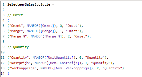
2. Field Parameters and dynamic KPI selection
Every leader views performance through a slightly different lens. Instead of building separate dashboards, field parameters in Power BI let users control what they see, with a single slicer.
- Revenue metrics: Omzet, Marge, Marge %
- Quantity metrics: Units sold, Gem. Kostprijs, Gem. Verkoopprijs
When to use:
Use field parameters when different users or departments want to view different KPIs, without creating multiple versions of the same dashboard.
How to use:
Create a field parameter table that holds your metric options (e.g., revenue, margin, units sold). Bind this to a slicer that updates all related visuals dynamically.
Pro tip / Business case:
Ideal for multifunctional dashboards where Finance tracks profitability, while Sales prefers quantity and pricing metrics, all within the same report.
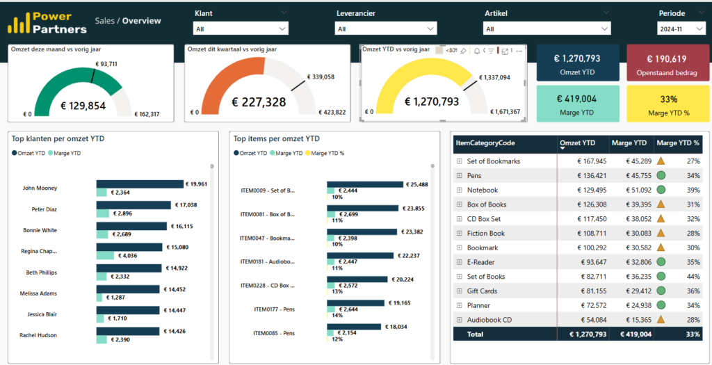
3. Colour-Coding KPIs — Visual Performance Signals
Colour is a shortcut to insight. Conditional formatting via DAX instantly communicates what’s working, what needs attention, and where focus is required.
Using DAX-powered conditional formatting, Power BI allows you to turn raw performance data into clear visual indicators. In our example, revenue KPIs are displayed using gauges that instantly convey status based on performance:
- Green means the current value is exceeding last year’s benchmark.
- Yellow signals that it’s tracking close to last year—neither strong nor weak.
- Red warns that performance is falling significantly below expectations (usually below 80%).
Gauge explanation:
Take the top-row example from our dashboard: sales for the current month are up by 38% compared to the same month last year. The gauge appears green. Year-to-date revenue, however, is slightly behind last year’s pace, so its gauge shows yellow. With just a glance, the executive team gets a high-level health check, without needing to read the fine print.
This visual consistency not only makes dashboards easier to interpret but also reinforces performance culture across departments. Sales, finance, HR, and operations teams all align around the same visual language, again without the need of multiple dashboards.
Your Colour Gauge measure would probably look something like this:
Color Gauge YTD = SWITCH(TRUE(),
  [Omzet YTD] <= [Omzet PY] * 0.8, 1,  // Red
  [Omzet YTD] <= [Omzet PY],      2,  // Yellow
  3                                  // Green)
When to use:
Use conditional colour logic when your dashboard needs to highlight performance status at a glance—especially for busy decision-makers.
How to use:
Write a DAX measure that outputs status codes based on thresholds (e.g., red, yellow, green). Apply this as conditional formatting to KPI cards or gauges.
Pro tip / Business case:
Perfect for executive summaries or dashboards sent before meetings—your leadership team can instantly spot risks or wins without reading the numbers.
4. Running Totals – Project Pipeline Insights
For project-driven businesses, especially in sectors like construction, engineering, or consulting, traditional revenue reports don’t always tell the whole story. What matters just as much as invoiced revenue is your backlog (an open order book if you will).
That’s where running totals in Power BI offer a unique strategic lens. By calculating the cumulative gap between accepted offers and invoiced amounts, you gain visibility into your project pipeline, and specifically how much work is committed but not yet delivered or billed.
In our dashboard example, this difference is tracked monthly under a KPI we call Project Pipeline. In April 2025, the chart shows over €3.3 million in signed contracts that haven’t yet generated invoices.
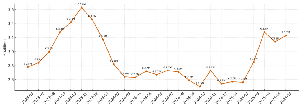
This type of running total helps surface critical operational dynamics:
- Projects delayed in execution
- Incomplete time registrations or billing lags
- Delivery teams under pressure
- Risk of future cash flow constraints
For operations, this view acts as a heat map of upcoming work. For finance, it’s a forecasting tool for near-term billing potential. And for leadership, it highlights where additional resources or intervention might be needed.
For example: the drop from 3.6M in 2023-11 to 2.6M in 2024-03 shows that either the sales engine is in trouble or we have been very actively delivering on projects.
Your Project Pipeline measure might look something like this:
Project Pipeline =
[Total Accepted Offers YTD] - [Total Invoiced Amount YTD]
When to use:
Use running totals when you want to track cumulative progress or backlog, especially in project-driven industries like construction, consulting, or software.
How to use:
Build measures that accumulate accepted offers and compare them to invoiced amounts over time. Visualise the monthly difference as unrealised revenue or workload.
Pro tip / Business case:
Segment the unrealised revenue by business unit, region, or project type to identify where the greatest risks—or opportunities—are sitting.
5. What‑If Parameters and scenario analysis
What if you could model tomorrow’s outcomes, today? That’s exactly what What‑If parameters in Power BI enable. Rather than presenting static performance data, they allow you to simulate business scenarios and instantly see the projected impact.
In our example, the dashboard models the financial outlook of a hotel in Bruges, Belgium based on two key drivers:
- Average nightly price (€)
- Occupancy rate (%)
With simple sliders, decision-makers can adjust these variables and instantly see updated projections for revenue, cost, and profit. The dashboard calculates how many nights are likely to be sold, the total income generated, and whether the business stays profitable, all in real time.
Beyond hospitality, What‑If scenarios can be applied in multiple departments:
- Finance: Adjust input costs or inflation factors and see margin impacts
- HR: Model headcount changes or salary adjustments
- Sales: Simulate win rates or pricing discounts to project revenue
What makes this powerful is the interactivity. Leaders can test assumptions, stress test their strategy, and build consensus without needing to run a full spreadsheet model each time.
Some of the measures in this example would probably look something like this:
// Total nights
Sold Nights =
365 * 'Room Settings'[Rooms] * 'Occupancy Slider'[Value]

// Revenue projection
Projected Revenue =
[Sold Nights] * 'Price Slider'[Value]

// Profit or Loss
Projected P&L =
[Projected Revenue] - [Avg Operating Cost]
When to use:
Use What-If parameters during planning cycles, pricing strategy sessions, or investment reviews—anytime leaders want to test assumptions.
How to use:
Create parameter tables in Power BI (e.g., price slider, occupancy rate) and write DAX measures that adjust core calculations like revenue or profit dynamically.
Pro tip / Business case:
Powerful for hospitality, real estate, HR, or SaaS, any sector where small variable changes can dramatically impact forecasts or margins.
Conclusion: from data to decisions
We use DAX measures to identify answers to some of the most prominent questions that come up during executive meetings, strategy discussions, and more, more often then not they boil down to one of the following:
- What is happening?
- Why is it happening?
- What might happen next?
- What should we do?
Power BI dashboards powered by DAX do more than report—they inform, guide, and shape decisions at the highest level. Whether you’re in strategy, finance, HR, or operations, this is where data turns into direction.
As your organisation scales, so does the complexity of your data. That’s why understanding how to use DAX effectively in Power BI is critical for transforming raw information into smart business action. From trend analysis to scenario modelling, DAX helps decision-makers stay ahead of the curve.
But remember: DAX isn’t the only language in Power BI. There’s also M language, the engine behind Power Query. While DAX is used for calculations and dynamic measures inside your report visuals, M is used for data transformation before the model is even loaded. Knowing when to use DAX vs M is key to building efficient, high-performance reports.
👉 Curious about the difference between DAX and Power Query (M)? Learn when and how to use each language to get the best results for your business intelligence strategy. Read our expert guide: Power Query vs DAX →


