
Everyone talks about data-driven decisions – but let’s be honest: how is that supposed to work when you’re drowning in data? Endless Excel sheets, countless departments, forgotten emails – and in the end, no one really knows what matters most.
Luckily, there’s a clear solution: visualization! Power Partners develops sales dashboards that turn data chaos into clarity – everything in one view. Today, we’ll show you how that looks in practice with Bellimmo, our Dashboard of the Month, and answer questions like:
- Can I get a bird’s-eye view of our sales performance?
- Can I compare this year’s results with last year’s?
- How can I spot trends or developments over time?
- Are these dashboards scalable?
- Can they really solve my sales challenges?
- Customer Story: Bellimmo’s Sales Transformation
- Ready to reach new performance heights?
Flying High – A Bird’s-Eye View on Sales
Sales-driven companies need visibility into what’s really happening. Performance, potential, and problems often hide in spreadsheets or are scattered across departments. With a Power BI report, those insights rise to the surface – giving you a clear overview (best enjoyed on a Smart TV in the office!).
Whether you’re a sales rep, key account manager, or executive – everyone stays informed, on course, and aligned with data. Dashboards point the way forward, keep goals in real-time focus, bring clarity to meetings, and offer instant health checks of your business – all at a glance.
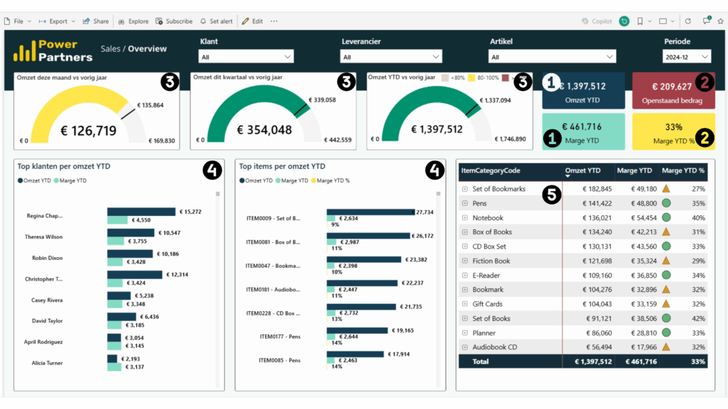
This overview combines real-time KPIs with clear, intuitive visuals. The most important metrics include:
1️⃣ Annual revenue and profit margin – instantly visible, no digging required
2️⃣ Open orders and profit margin (%) – always current, always relevant
3️⃣ Comparison gauges: month, quarter, and year vs. previous year
4️⃣ Top customers and products – ranked by revenue and margin impact
5️⃣ Margin breakdowns by category – color-coded for quick insights
With just one click, you can filter by region, customer group, or product line.
Year-to-Date Benchmarking: Is This Year Performing Better?
Beyond the big-picture bird’s-eye view and the deeper trend analyses – the moles of Power BI dashboards, digging below the surface – we add a valuable middle layer: a Year-to-Date (YTD) benchmarking view. This feature delivers a clear, side-by-side look at your performance this year compared to the previous one.
With dynamic measures, filters, and field parameters, you can analyze progress flexibly – by month, quarter, or full year.
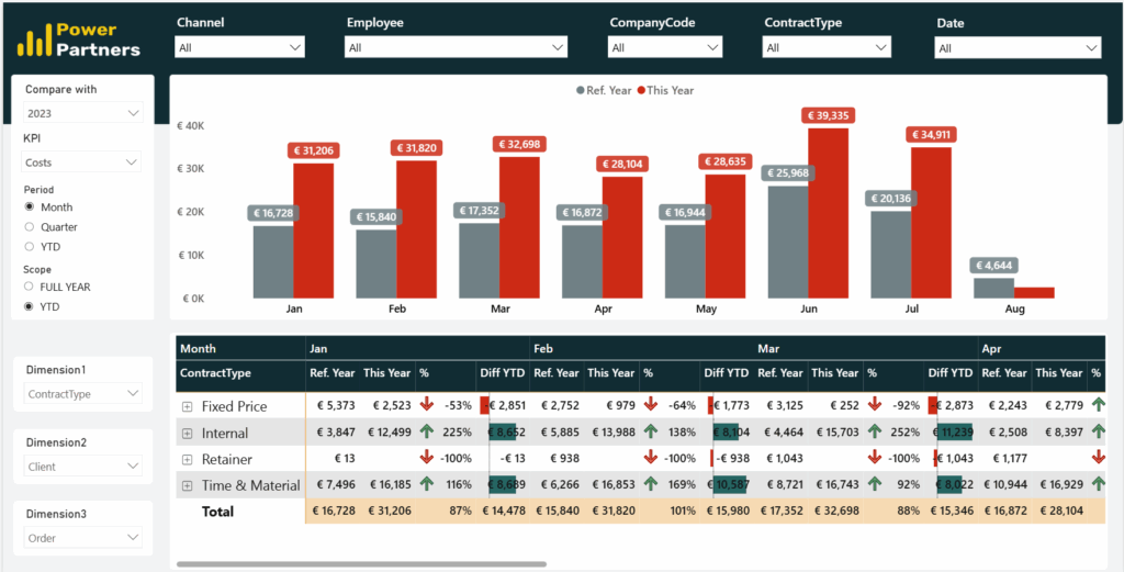
But it’s not just about what has happened – it’s also about what’s ahead. Switching to the full-year view gives you a preview of the months to come, based on last year’s data. This middle layer becomes especially useful (and reassuring) during those high-pressure moments – like the year-end sprint.
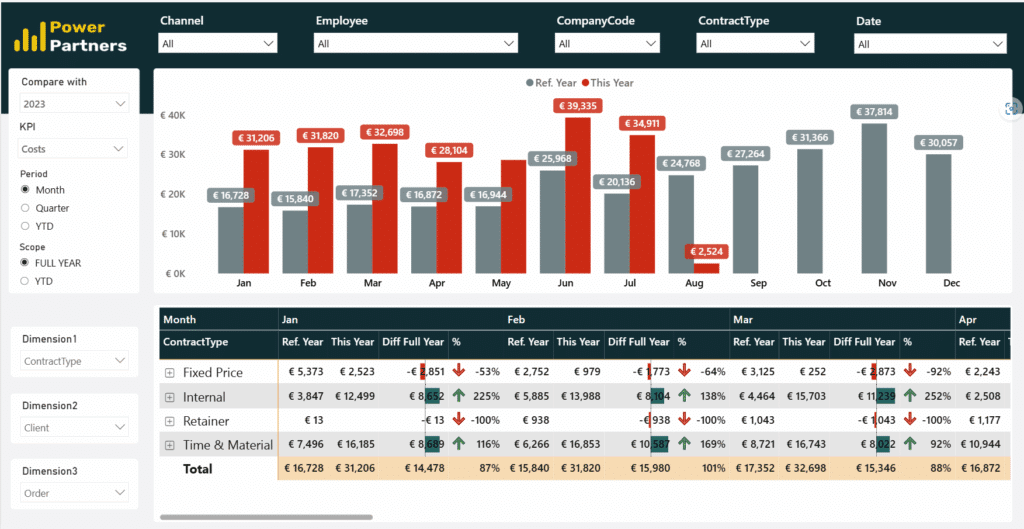
From Trends to Timing – The “Development” Page
Where do we stand? Where are we headed? And how did we get here? These are the questions answered by the Development page – the heart of our trend analysis. Time is the key factor here.
By analyzing data over time, patterns, performance curves, and anomalies become visible – and suddenly, the why behind changes comes into focus: Why did revenue drop in Q2? Why are some customers ordering less? Which pricing adjustments had the biggest impact?
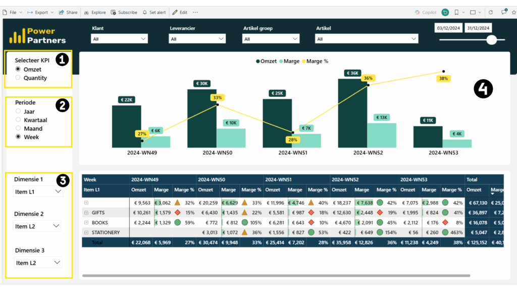
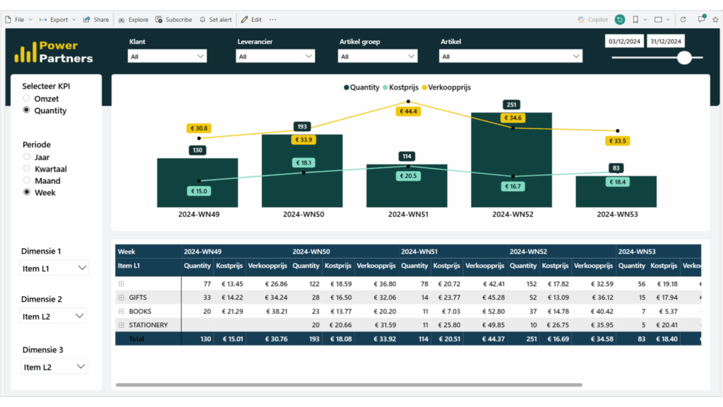
Powerful integrated filters and dynamic parameters make it easy to dig deeper:
- Switch between KPIs (e.g., revenue, quantity, margin %)
- Choose timeframes (week, month, quarter, or year)
- Drill down into products, customer segments, or regions
This layer of analysis supports both strategic and operational decisions – from planning promotions and renewing contracts to spotting volume gaps. The insights gained here give your sales team a clear edge when preparing for the next big sales push.
And unlike traditional reports, this dashboard updates automatically – so your team gains fresh insights without any extra effort. Always ready for the next decision.
Today, Bellimmo uses this view to identify margin risks early, plan stock levels efficiently, and adapt their sales strategy dynamically to real market demand – all on a single page.
Customer Story: Bellimmo’s Sales Transformation
Like many growing businesses, Bellimmo struggled to juggle multiple tools, chase down scattered data, and make sense of endless spreadsheets. Despite all the effort, the full picture was missing: sales reports and margins weren’t analyzed continuously, and strategic decisions often came too late – understandably so, since the data wasn’t available in real time.
Our mission was to make sales insights simpler, more structured, and faster to access. The result:
- Clear performance comparisons on a monthly, quarterly, and yearly basis
- Early detection of inactive customers
- Better inventory planning through order pattern analysis
- Data-backed pricing and negotiation strategies
And the transformation didn’t take months. Starting with a solid, flexible foundation, we customized Bellimmo’s dashboard in just a few weeks – with the active involvement of their team.
I wanted more insight into margin and revenue per customer, product, and trip — Business Central didn’t offer clear reports for that. With the dashboard, I can now react immediately when a customer orders less or when the margin doesn’t look right. At first, it was a lot to take in, but once I got used to it, it became a real game changer. Today, I can see where we stand at a glance, spot trends, and take action — a big step forward in our digitalization.
Lynn, Bellimmo
Growing With You – Scalable Dashboards
Businesses aren’t static. They evolve, restructure, and uncover new potential. Our dashboards grow with you – flexible and scalable, whether you’re a start-up or scale-up.
We don’t start from scratch – we build on a proven, field-tested foundation that allows for fast implementation while tailoring every element to your unique setup:
- Sales hierarchy: regions, representatives, product lines, etc.
- Data model & sources: ERP, CRM, Excel, APIs
- Strategic KPIs & business definitions: fully customized
- Workflow rhythm: from weekly team meetings to quarterly board reports
New KPIs? Growing teams? No problem. The dashboard can easily expand – adding tabs for pipelines, returns, campaigns, or inventory as your business evolves.
Ready for Take-Off?
Still fighting with overloaded Excel sheets or messy CRM reports? Then it’s time to take off – or at least get ready for take-off. Our dashboard turns your business data into clear, interactive insights so you can act faster, make better decisions, and truly steer your sales team.
Curious? We’d love to walk you through a live demo or set up a sandbox version in your own environment. No pressure. Just potential.
Interested in our Sales Dashboard? Get in touch for more information or book an informal walkthrough with one of our experts.


