Content
- 1. Reports aren't getting the traction you expected.
- 2. Reasons why Power BI adoption fails.
- 3. Sharing strategy is part of the design.
- 4. Proven Power BI collaboration features.
Reports aren’t getting the traction you expected.
Has this ever happened to you: You’ve invested time and resources into Power BI. The reports look great, the data flows correctly. Everything works as intended. But after launch, adoption lags: users aren’t engaging, feedback is scarce, and it feels like the effort isn’t paying off.
You’re not alone.
We’ve seen countless Power BI projects struggle, not because the reports aren’t good, or the data is wrong, but because the sharing strategy and more importantly, the data culture falls short. Insight doesn’t just depend on the report itself; it’s about how, when, and where it is delivered, and whether your people are encouraged and enabled to work with data.
This blog dives into the other half of reporting success: building a smart, targeted sharing strategy that also nurtures a strong data culture. We’ll explore common adoption challenges, practical fixes, and ways to make the most out of the tools you already use.
Top 4 reasons why Power BI adoption fails, and what you can do about it
A polished report is only half the story. Here are the reasons we’ve seen adoption fall flat in over 50+ real-life implementations:
- Hard-to-find reports: If reports are buried in complex folder structures, they’re forgotten. Easy access drives usage.
- Dashboard overload: Too many reports, without clear relevance overwhelm users and dilute attention.
- No context or guidance: Without onboarding or tooltips, even the best dashboards can feel confusing and intimidating.
- No feedback loop: If users feel unheard, engagement drops. Listening matters.
When these issues persist, users disengage and your data culture remains weak.
Why your sharing strategy is part of the design
Your report might be brilliant. But if no one opens it, it doesn’t matter. Sharing isn’t a last step, it’s part of the design process, and a cornerstone of building a data-driven culture.
A good strategy ensures reports are delivered where your audience already works, when they need them, and in a way that encourages action and ownership. This is how you cultivate a healthy data culture: by making insights accessible, understandable, and actionable.
Think about sending a Monday morning financial snapshot by email. When you work towards your delivery with the same care as design, you turn passive data into active decision-making tools.
At Power Partners, we integrate sharing strategy from the very first workshop, because encouraging data habits is part of our goal.
When we sit down with stakeholders, we ask:
- Who will use this report, and how often?
- What level of data access do they need?
- How do they currently generate insights?
From there, we make sharing part of the blueprint and an enabler of data culture:
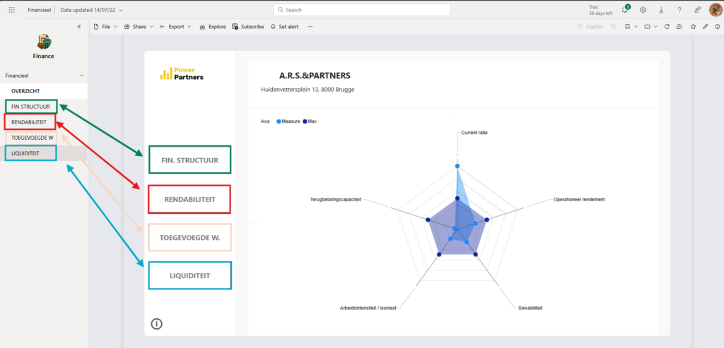
- Row-Level Security (RLS): Project managers only see their own projects, while the management team sees them all.
- Audience-level visibility: Some metrics may be visible to all, others stay restricted.
- Scheduled refresh times: Nightly is standard, but some users want a midday or evening refresh to evaluate daily performance.
- Delivery preference: Some prefer email snapshots; others like Teams integrations or embedded tabs.
Workshop examples:
- In project-based companies, we regularly design RLS into project reports so different levels of the business only see what’s relevant. Meanwhile, KPIs like "average completion rate" or "total amount of projects" are shown company-wide but without project breakdown.
- For one client, we adjusted data refresh timing to twice a day, once overnight and once at 6pm, so managers could evaluate daily performance before closing time.
- For another, we added stock alerts that directly deliver an email to the purchasing team when action is needed, encouraging real-time response and reinforcing a data-first culture.
8 Proven Power BI sharing features to drive collaboration
Sharing reports in Power BI isn’t just about distribution—it’s about enabling collaboration. The right sharing method brings your data into the conversations and workflows where decisions are made.
We’ve grouped the most effective sharing approaches below. Each supports different levels of collaboration, with unique strengths, limitations, and ideal audiences to help you choose the best fit for your team.
📦 Power BI Apps – Internal organised access
Best for: Structured access to bundles of reports by department
Skill level: Medium
Watch out: Governance is key for long-term manageability
Power BI Apps allow you to group multiple reports and dashboards into a clean, user-friendly experience. You can define specific audiences, so each role (e.g. Sales, HR, or Management) gets a tailored view that matches their needs. This helps reduce clutter and keeps things focused.
Note: In Microsoft terminology, what we as Power Partners often call dashboards are technically referred to as "reports". Being clear on this distinction helps with onboarding and user training.
Pro tip: Make use of the audience feature to customise the app interface for each user group. This keeps the experience relevant, intuitive, and scalable.
🗣️ Microsoft Teams Integration – Live in the flow of work
Best for: Daily collaboration and team conversations
Skill level: Beginner to Medium
Watch out: Channel clutter if overused
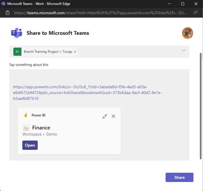
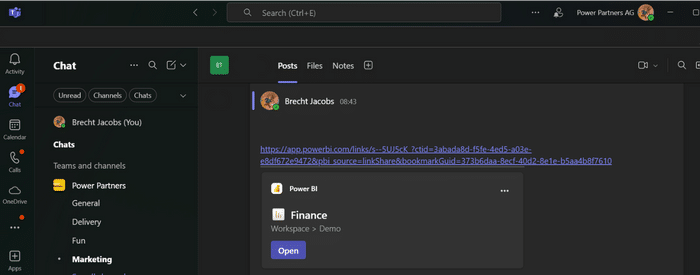
Power BI integrates seamlessly into Microsoft Teams, allowing you to embed reports directly into channels or chats. This makes your data a natural part of the conversation. Use the “Share to Teams” option from within Power BI for one-click access, and consider setting up a dedicated “Insights” tab to keep everything organised.
Example: For some clients, we embedded daily reports in Teams channels. This allows leaders to monitor trends in real time, discuss results on the fly, and take immediate action, improving both accountability and response time.
You can share directly from Power BI using the “Share to Teams” option and even include a message.
📧 Email Subscriptions – Passive delivery for executives and passive users
Best for: Leaders and stakeholders who prefer inbox updates
Skill level: Beginner
Watch out: Reports are static (no filters or drilldowns)
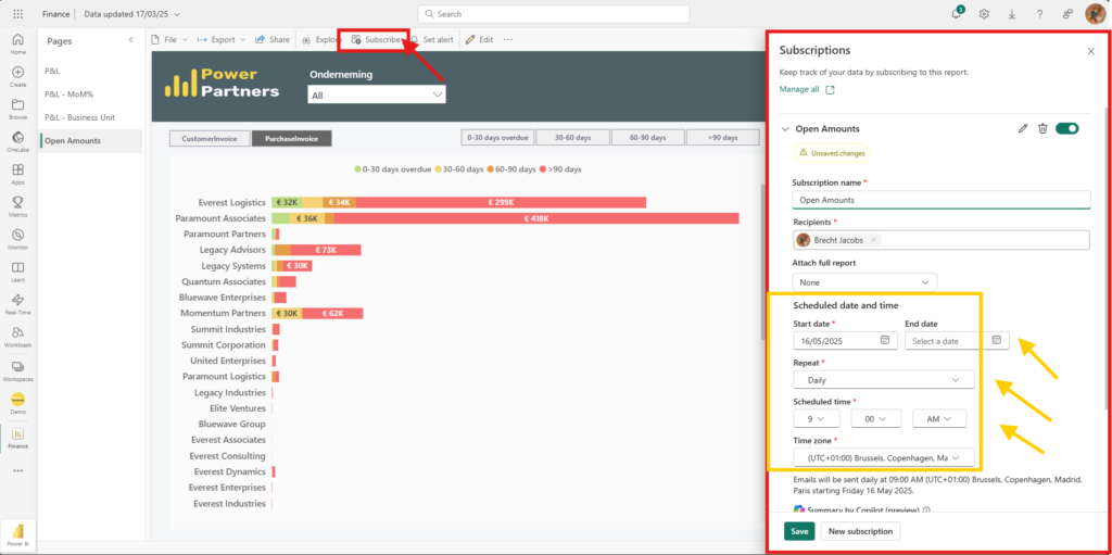
Email subscriptions let you schedule and automate the delivery of Power BI reports straight to users’ inboxes. You can define both frequency and timing, ensuring the right people get the right insights at the right moment.
Use case: Executives often prefer high-level summaries without having to log in. A weekly email snapshot with top KPIs ensures they stay informed with minimal effort.
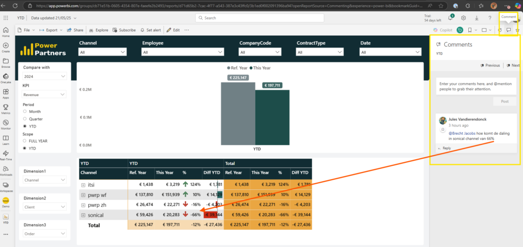
📋 Power BI comments – Create a feedback loop
Best for: Conversations on specific visuals
Skill level: Medium
Watch out: Needs active user engagement to be effective
Comments allow users to start discussions directly on report visuals, fostering collaboration right where the data lives. This feature is ideal for gathering feedback, flagging anomalies, or prompting action—and it keeps context intact: the reader of the comment has a bookmark that will lead him exactly to the view that the commenter had.
Despite being underused, comments build transparency and help promote a culture of shared ownership over data insights.

🗣️ Power BI Proxy – Bring your reports to a TV
Best for: Team goals, Shopfloors, Operational dashboards; data culture
Skill level: Medium
Watch out: Requires an installation by Power Partners
Power BI Proxy is a great way to improve your data culture. Contrarily to Publish-to-web, Power BI Proxy is a safe way to bring your reports, your KPIs to a screen at your office. See here for more information: Power BI Proxy
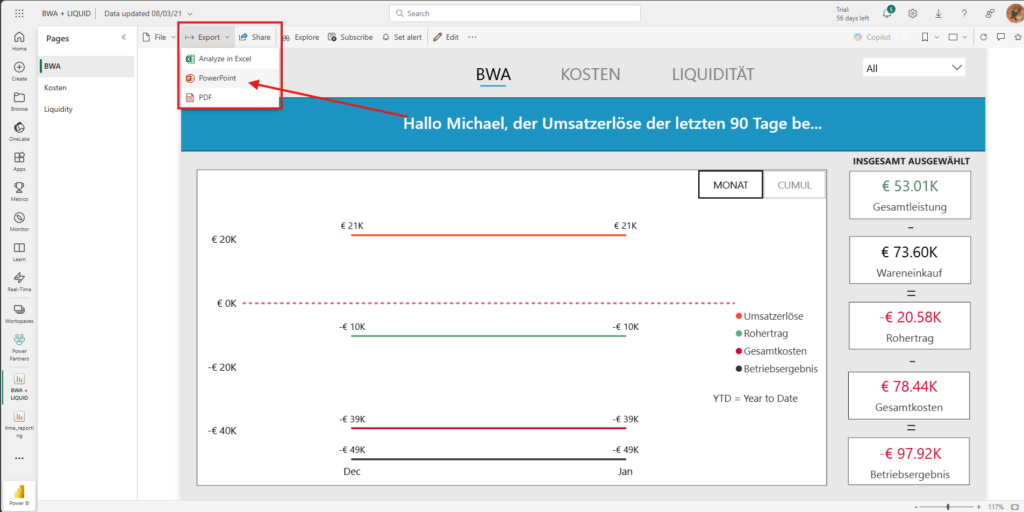
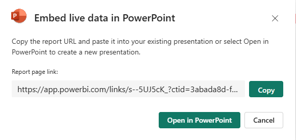
🌎 Embed in PowerPoint – Presentations that stay live
Best for: Recurring meetings, board updates
Skill level: Medium
Watch out: Needs internet and correct user access
Embedding Power BI visuals into PowerPoint allows you to present live, interactive data in your slide decks. This means your presentations stay up to date, even if the numbers change between meetings.
How-to tip: You can export reports directly from Power BI or use the “Insert > Power BI” option in PowerPoint to embed live visuals. Just make sure the presenter (or the report recipients) have the right permissions, a Pro license, and a stable internet connection.
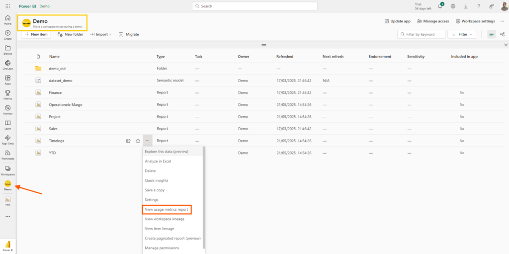
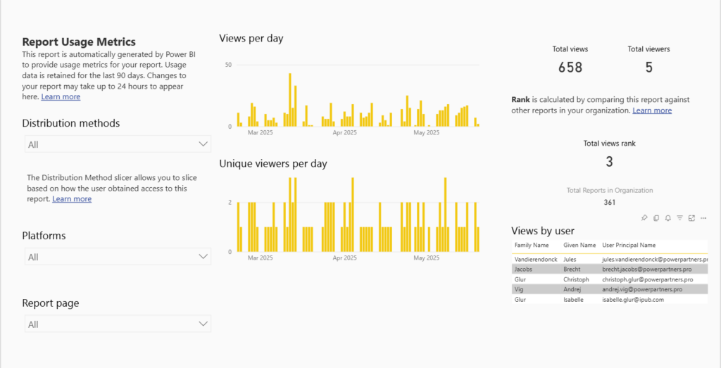
📊 Usage Metrics Report – Measure, learn, adapt
Best for: Power users, admins
Skill level: Advanced
Watch out: Requires interpretation, consistency, and follow-up
The Usage Metrics Report gives you a clear view of how reports are being used. You can track which users opened which reports, how frequently, and when. This data is invaluable for identifying adoption gaps and opportunities for improvement.
Strategy tip: Let your users know that engagement is being monitored. In many cases, the awareness alone drives more consistent usage and accountability.
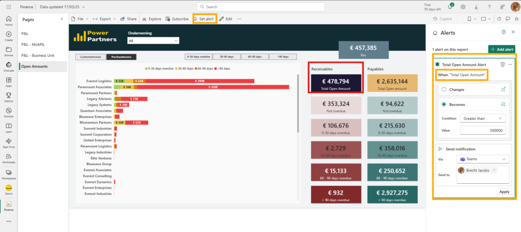
🔔 Alerts – Act on key changes instantly
Best for: Operational triggers (e.g. targets reached, thresholds passed)
Skill level: Beginner
Watch out: Only works with single-value visuals
Alerts notify users when a key metric crosses a defined threshold. These alerts can be configured to send messages via email or Microsoft Teams, helping teams react in real time without constantly monitoring dashboards.
Example: Set an alert for when open invoices exceed €500K, so the finance team is immediately informed and can follow up accordingly.
Honourable Mentions
But wait, there's more!
Export (PDF/Excel/PPT): Ideal for regulatory submissions, audits, or static sharing. Just remember: exports are snapshots and do not update dynamically (which - depending on the case - may be a desirable behaviour). If you have a lot of exports that you need to do each month, we recommend our Automation Server. Ask us!
Publish to Web: Allows anyone to view your report publicly via a URL. However, since there’s no security or permissions layer, we recommend this only for non-sensitive public-facing data. See here for details: Power BI on every Smart TV. As an alternative, we recommend Power BI Proxy.
Note: For internal collaboration, we advise steering clients towards secure, built-in Power BI features like comments and Teams integrations instead.
Practical adoption tips
- Start small: Launch one impactful report, observe how it’s used, gather feedback, and expand from there.
- Pin key visuals: Highlight the most important insights front and centre, no one should have to dig for what matters.
- Embed where users work: Whether it's Teams or SharePoint, engaging users in the tools they already use daily will improve adoption.
- Use bookmarks: Enable users to personalise their views, increasing relevance and usability.
- Provide onboarding: Include tooltips, intro tabs, and light documentation to build user confidence.
- Celebrate success: Share real examples of how data led to a better decision or outcome.
- Leverage user metrics: Use data to track adoption trends, and don’t be afraid to iterate.
Share your reports wisely.
Successfully sharing reports isn't just about access, it's about adoption. Whether you're rolling out a dashboard to a handful of colleagues, or to an entire organization, the difference will be made by how you present, structure, and support your data tools. Below, we outline the most common pitfalls that hinder adoption, and share practical tips to help your team get the most value from your reporting efforts.
❌ Don’ts
- Mismatched sharing methods and audiences
Know your users and share accordingly. - Assuming access equals engagement
Users need to know how and why to use the report. - Overloading Teams with dashboards
Structure is everything—naming and organization matter. - Having no training or introduction
Onboard your users to your report just like any other tool. - Sharing too much, too fast
Start small and expand based on usage and need.
✅ Do’s
- Use comments
Build context and promote conversation. - Pin what matters
Focus attention on key insights. - Monitor usage and iterate
Let data guide you. - Promote personal bookmarks
Encourage customized views. - Include lightweight guidance
Tooltips or intro pages can go a long way.
How to choose the right Power BI sharing option for your team
There’s no one-size-fits-all when it comes to sharing Power BI insights. Choosing the right distribution method depends on your audience, data sensitivity, user habits, and the tools your team already uses every day. Here's how to break down your decision:
- Internal vs. external: Internal teams might use Power BI Apps or Teams; clients and partners need tailored access.
- Security matters: Sensitive data? Use Row-Level Security and enforce login protocols.
- Usage frequency: Daily users need quick access in familiar platforms. Occasional users might prefer emailed summaries.
- Digital habits: Embed reports where your users already work: Teams, CRM systems, SharePoint.
Practical strategies that work
Adoption doesn’t happen on its own. It requires deliberate effort to design reports that are not only functional but also easy to find, easy to use, and clearly valuable. Here are some practical strategies that help turn casual viewers into engaged users:
- Start with one impactful report: Focus, learn, and scale from success.
- Pin key metrics: Front and center, no digging needed.
- Communicate clearly: Tell users where reports are and why they matter.
- Offer guidance: Tooltips, intro tabs, and short walkthroughs boost confidence.
- Embed in daily tools: Reduce friction. Meet users where they are.
- Celebrate wins: Share success stories to fuel momentum.
Final thoughts: Sharing is a design choice, and a cultural one
Building the report is only part of the journey. Sharing it effectively determines whether insights drive action, or fade into the background. But even more, it shapes your organisation’s attitude towards data.
Treat sharing as a deliberate design and culture-building choice, with the same precision you apply to modelling and visuals. Because when sharing is done well, data becomes more than numbers, it becomes a habit.
And that’s when the culture changes.
Want to learn more about building a data culture?
Discover how to embed data into your company DNA with our step-by-step guide: Data Culture – How to transform your company in 7 steps
Interested in how Power Partners can help you and your team improve Power BI adoption?
Leave your e-mail address and get all the details!


